A calibration study across 14,100 games and 2.4 million plays.
If you’ve ever followed stats of a college football game on ESPN, you’ve seen it: the win probability prediction tracker on the screen telling you how likely each team is to win. Before the game, the number is static — ESPN’s model digesting whatever it knows before kickoff. The moment the ball is snapped, it starts moving.
I’ve always been curious how accurate those numbers actually are. Not just whether they “feel right,” but whether they hold up statistically. So I scraped ESPN’s play-by-play data for every available Division I game I could get — roughly 14,100 games across the 2015–2025 seasons, yielding 2.4 million individual play-level predictions — and ran a proper calibration study. Similar calibration audits have been done for ESPN’s NBA win probability model (Inpredictable, 2018; Lopez & Matthews, 2020), but to my knowledge, no one has done this systematically for college football.
The code and data pipeline are in the GitHub repo. This post is about what I found.
What Does “Good” Mean?
Before anything else, we need a definition. A probability forecast is calibrated if the stated probabilities match observed frequencies. If ESPN says a team has a 70% chance of winning, that team should win about 70% of the time — across all plays where that probability was given.
Three metrics do most of the work here.
Brier Score measures average squared error between predicted probability $\hat{p}$ and actual outcome $y \in \{0, 1\}$:
$$BS = \frac{1}{N} \sum_{i=1}^{N} (\hat{p}_i - y_i)^2$$A score of 0 is perfect; 0.25 is what you’d get from always predicting 50%. Lower is better. For reference, a model that simply predicts the home team wins at the base rate (~61%) every time would score around 0.24 — so the gap between 0.119 and that naive baseline is the real signal.
Expected Calibration Error (ECE) groups predictions into bins by probability and measures the weighted average gap between mean predicted probability and actual win rate in each bin:
$$ECE = \sum_{b=1}^{B} \frac{|B_b|}{N} \left| \bar{p}_b - \bar{y}_b \right|$$An ECE of 0 means the predictions are perfectly calibrated. An ECE of 0.05 means the model is off by about 5 percentage points on average.
Observed-to-Expected Ratio (OTE) is a simpler aggregate check: the ratio of actual wins to the sum of predicted win probabilities. A value above 1.0 means the model is underpredicting wins; below 1.0 means overpredicting.
$$OTE = \frac{\sum y_i}{\sum \hat{p}_i}$$These three measure related but distinct things. Brier rewards confidence: predicting 0.9 on a team that wins gives a Brier score of $(1-0.9)^2 = 0.01$; predicting 0.6 on the same winner gives $(1-0.6)^2 = 0.16$. Hedging hurts, even when the direction is right. ECE and OTE both capture systematic bias — the difference is that OTE tells you the direction (are wins over- or under-predicted overall?), while ECE measures the average magnitude of that bias across the probability range without caring which way it runs. It’s worth noting that estimating win probability from play-by-play data is deceptively difficult — Brill, Yurko, and Wyner (2025) showed via simulation that the dependence structure of play-by-play data (every play in a game shares the same win/loss outcome) substantially inflates estimator bias and variance, substantially reducing effective sample size.
A Quick Look at the Data
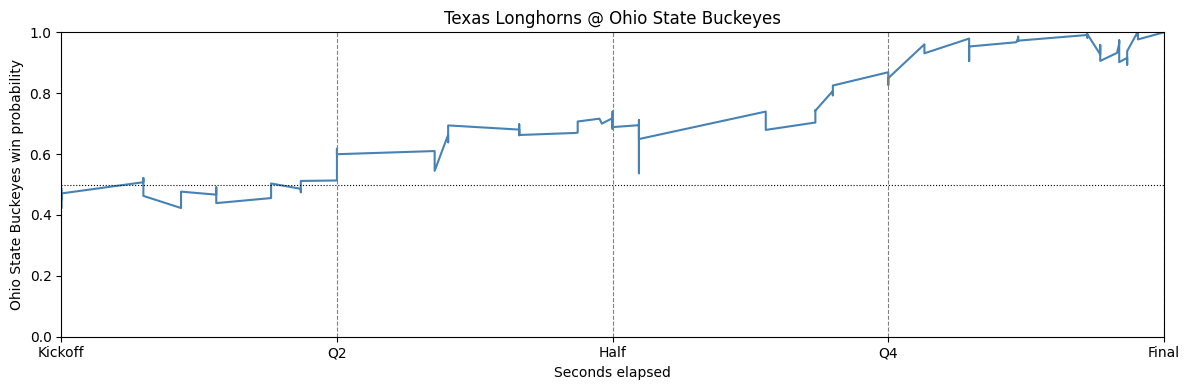
Example win probability trace for a single game — Texas @ Ohio State, 2025. Probability updates roughly play-by-play from kickoff through final.
That chart shows what ESPN’s model is doing throughout a single game. It starts with a pre-game probability and updates throughout the game. Some games look like a slow walk from one endpoint to certainty; some are chaotic back-and-forth.
Throughout, these probabilities represent the home team’s predicted probability of winning. Zooming out to the full dataset, the distribution of all in-game win probabilities (which is one probability per play within each game) is roughly U-shaped — lots of plays near 0 and 1. This pattern is easily explained because each game trace ends at 0 or 1. The pre-game distribution is more interesting.
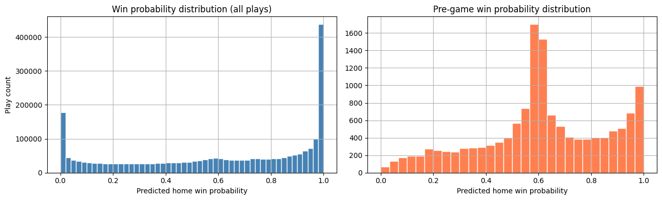
Histogram of all (left) and pre-game (right) win probabilities.
There’s a sharp spike near 0.60. Home teams win college football games at about 61% overall (61% in this dataset) — and it looks like ESPN’s model falls back to something close to that average for a substantial chunk of games. We’ll come back to this.
Calibration During Regulation
The Aggregate View
Overall, the numbers look good. Across all 2.4 million plays:
| Metric | Value |
|---|---|
| Brier Score | 0.119 |
| ECE | 0.006 |
| Pre-game OTE | 1.002 |
An ECE of 0.006 means the model is off by less than a percentage point on average. An OTE of 1.002 means home teams won almost exactly as often as expected. That’s a well-calibrated model.
Does It Hold Up Through the Game?
The more interesting question is whether calibration degrades — or improves — as the game progresses.
OTE by Minute
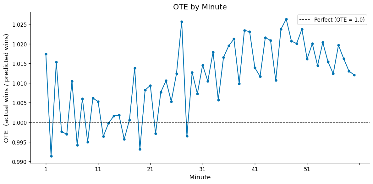
The OTE plot shows something subtle: through the first half, the ratio hovers close to 1.0. In the second half it creeps upward, reaching around 1.018 by Q4. ESPN is consistently underpredicting home team wins by a small margin later in games. The effect is very small (~1.5-2%), but it appears systematic.
Brier Score and ECE by Minute
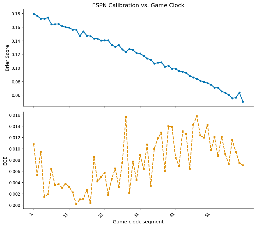
The Brier score drops steadily as the game progresses — from ~0.18 in minute 1 to ~0.05 near the final whistle. This is expected: early in games, results are naturally less certain, so predictions stay closer to 0.5, resulting in a higher Brier score even when well-calibrated. As a game becomes a blowout or a clear result, predictions move toward 0 or 1, and a well-calibrated model scores lower.
ECE tells a different story. It’s quite low (0.001–0.010) through most of the first half (first 30 minutes), but picks up slightly in the second half (reaching around 0.012–0.016 in individual minutes). This aligns with what the OTE plot was suggesting — a modest but real pattern of bias in the predictions. The OTE analysis showed this bias was in the direction of underpredicting home team win probability in the final stretch.
The takeaway: the predictions are good. The miscalibration is real but small, and it’s directional — home teams win slightly more often than predicted late in games.
Reliability Diagrams by Quarter
The reliability diagram is a clean visual tool for assessing calibration: it plots predicted probability on the x-axis against actual win rate on the y-axis. The diagonal is perfect — when the model says 70%, the actual win rate should be 70%. Points above the diagonal are underconfident; below is overconfident.
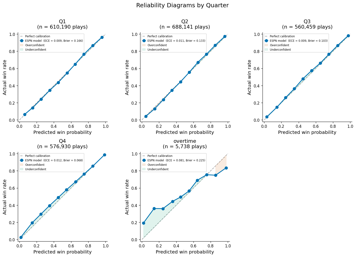
Q1 through Q3 all sit close to the diagonal - with a slight break noticeable starting in Q3. Q4 shows a noticeable pattern: when the model gives the home team a lower probability (say, 20–40%), the actual win rate is slightly higher. Like the previous metrics, this is telling us the model is underpredicting home team win probabilities late in the game (albeit, but a very small margin).
When It Breaks: Overtime
Overtime is a different animal. By the time you reach overtime, the game is close — ESPN’s model is being asked to do probability estimation in a near-coin-flip regime where small differences matter a lot.
| Metric | Regulation | Overtime |
|---|---|---|
| Brier Score | 0.119 | 0.225 |
| ECE | 0.006 | 0.081 |
The Brier score nearly doubles. ECE goes from 0.6% to 8.1% — a 13x jump. The reliability diagram for overtime (above) looks like chaos.
What’s interesting again and clear from the reliability diagram, is that if the model predicts the home team’s chance of winning is lower than about 0.6-0.7, it is not giving the home team enough credit. Ultra low predictions, say 0.2, have actual win rates closer to 0.35-0.4. This is flipped when the model predicts high probabilities for the home team. When ESPN is saying the home team has a 0.8 chance of winning, it looks to be a bit lower in reality (~0.75). Given the sample sizes are low we’d expect some variation, but the deviations from the diagonal are still quite interesting here.
This isn’t entirely surprising. College football overtime is a fundamentally different format than regulation (alternating possession from the 25, forced 2-point conversions after several possessions). The rules have also changed over the years, which makes any historical model trained using data from different overtime formats structurally incorrect. Most importantly, overtime is rare - only 535 / 14,100 games in the dataset went to overtime. The model simply doesn’t have a lot of good information to handle overtime well.
The Spike at 60%: What’s Actually Going On
Back to that pre-game histogram. Out of 14,100 games, 4,034 — about 29% — had a pre-game probability between 0.55 and 0.65. That’s a lot of games landing in the same narrow window.
The pattern is explained almost entirely by which teams are playing:
| Group | Near 60% | All Others | % Near 60% |
|---|---|---|---|
| G5 or FCS | 3,600 | 5,948 | 37.7% |
| Power Five | 434 | 4,118 | 9.5% |
Power Five schools are generally considered larger programs with larger fan bases and interest compared to G5 and FCS. Drilling into FCS specifically — ESPN’s group 81, a subset of that G5/FCS bucket — the effect is even more concentrated. Nearly half of all pre-game probabilities for FCS games land near 60%:
| Subdivision | Near 60% | % Near 60% |
|---|---|---|
| FCS (group 81) | 3,115 | 49.4% |
| FBS (group 80) | 919 | 11.8% |
The attendance numbers tell the same story. Games near 60% have a median attendance of 7,179; other games have a median of 22,348. Smaller crowds proxy for smaller programs — ones that generate fewer national games, fewer historical data points, and less signal for ESPN’s model to work with.
The interpretation is straightforward: when ESPN’s model doesn’t have enough information to give a meaningful spread, it falls back toward the historical base rate — which is roughly 61%. It’s not broken behavior. Home teams win more, the model knows this, and it defaults to that prior when it can’t do better.
Bottom Line
ESPN’s win probability model is well-calibrated. The headline numbers (ECE ~0.006, Brier ~0.119 across 2.4 million plays) hold up. The pre-game OTE is basically spot on accurate.
The more interesting story is in the places where the model reveals its assumptions:
- A modest systematic tendency to underestimate home team win probability in Q3 and Q4.
- Poor overtime calibration — a structurally different format with a small historical sample.
- A large chunk of G5 and FCS predictions anchored to the historical home win rate rather than game-specific information.
These aren’t failures so much as tells. Each one reveals something about how the model was built and what it was optimized for. The spike at 60% is the clearest example: what looks like a real-time probabilistic model is, for a large fraction of games, doing something much simpler under the hood.
References
Brill, R. S., Yurko, R., & Wyner, A. J. (2025). Exploring the difficulty of estimating win probability: a simulation study. arXiv preprint arXiv:2406.16171. https://arxiv.org/abs/2406.16171
Lopez, M. J. & Matthews, G. J. (2020). Evaluating real-time probabilistic forecasts with application to National Basketball Association outcome prediction. arXiv preprint arXiv:2010.00781. https://arxiv.org/abs/2010.00781
Stern, H. (2018). Judging win probability models. Inpredictable. https://www.inpredictable.com/2018/01/judging-win-probability-models.html
Data: ESPN unofficial play-by-play API, 2015–2025. FBS + FCS Division I games. Code to scrape the data is available at github.com/jrlewi/college_football_calibration_study.